
This animation of the NIH’s 2019 Monitoring the Future survey highlights drug use trends among the Nation’s youth for marijuana, alcohol, cigarettes, and prescription drugs.
Video length: 3:33
Transcript
[Music]
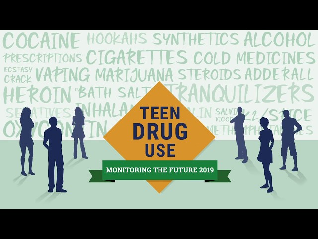
On screen: Drug-related words appear on screen with two human silhouettes on the left and two on the right. In the middle, a gold diamond shape appears that reads, “Teen Drug Use.” A green banner appears across the bottom that reads, “Monitoring the Future 2019.” A third silhouette appears on the right and left sides of the screen.
On screen: Background transitions to blue. Text appears: “Monitoring the Future is an annual survey of 8th, 10th, and 12th graders conducted by researchers at the Institute for Social Research at the University of Michigan, Ann Arbor, under a grant from the National Institute on Drug Abuse, part of the National Institutes of Health.”
On screen: Green background slides up from the bottom. Text reads: “Since 1975, the survey has measured how teens report their drug, alcohol, and cigarette use and related attitudes in 12th graders nationwide; 8th and 10th graders were added to the survey in 1991.”
On screen: Blue background slides up from the bottom. Text reads: “42,531 students from 396 public and private schools participated in the 2019 survey.”
On screen: An off-white background slides ups from the bottom of the screen. A green ribbon unfolds across the top of the screen. Text appears: “Illicit Drug Use”
Text appears on the off-white background: The heading reads, “Illicit drug use steady” and the subheading reads, “Past year use among 12th graders”
A dark blue chart appears, with a horizontal scale showing the years 1991, 1997, 2018 and 2019, and a vertical scale on the left ranging from 10% to 80% in increments of 10.
A gold line appears at the intersection of 30% and 1991 and draws across the chart, to the right, ending at 38% and 2019. A marijuana leaf appears near the 2018 mark. A green line appears at the intersection of 1991 and about 17% and draws across the chart to the right, ending at 11.5%. At the intersection of 2018 and 11.5%, a marijuana leaf with a circle and diagonal line from top left to bottom right appears on the green line. A green box with the text, “Any illicit drug NOT including marijuana 11.5%” appears to the right. At the intersection of 2018 and 38% a marijuana leaf appears on the gold line. A gold box with the text, “Any illicit drug 38.0%” appears to the right of the chart.
The chart shifts to the far left. A dark grey line drops from under the green ribbon splitting the screen into two sides. A white box appears in the middle of the right side. Text above the white box appears that reads, “Past Year Illicit Drug Use” and below it the text reads, “Past year use among 12th graders.”
Blue bars extend from the left side of the white box to the right to visually represent the amounts of marijuana, LSD, synthetic cannabinoids, cocaine, MDMA, and heroin. From top to bottom the chart reads, “35.7%, Marijuana,” “3.6%, LSD,” “3.3%, Synthetic Cannabinoids,” “2.2%, Cocaine,” “2.2%, MDMA,” and “0.4%, Heroin.”
On screen: A light green background fades in and a dark green ribbon appears across the top. The text in the ribbon reads, “Daily marijuana use in lower grades increases but past year marijuana use steady.”
White boxes appear on the left and right sides of a grey line that drops from below the green ribbon, dividing the screen into two sides. Across the bottom center of the screen a green box with the text “8th graders” appears on the left, a gold box with the text “10th graders” appears in the center, and a blue box with the text “12th graders” appears on the right.
On the left side, the heading reads: “Daily marijuana use” and the subheading reads: “sees significant increase among 8th and 10th graders since 2018.” The white box becomes a graph with the years 2017, 2018, and 2019 on a horizontal axis at the bottom of the box. The vertical axis ranges from 2% to 8% in increments of two.
In the same graph on the left, the word “Daily” is underlined in dark blue in the heading “Daily marijuana use.” A green line graph crosses the chart, peaking at 1.3% in 2019 followed by a gold line chart peaking at 4.8% in 2019, then a blue line chart peaking at 6.4% in 2019. A green box pops up with the text “1.3%” at the green line chart peak, a gold box pops up with the text “4.8%” at the gold line chart peak, and a blue box pops up with the text “6.4%” at the gold line chart peak.
On the right side the heading of the graph reads: “Past year marijuana use” and the subheading reads: “gap closing between older grades.” The word “year” in the heading is underlined in in dark blue. The years 2017, 2018, and 2019 appear horizontally across the bottom of the graph. The vertical axis on the left ranges from 10 % to 40% in increments of 10.
A green line graph crosses the graph to 2019 and ends at 11.8%, a gold line crosses the graph to 2019 and ends at 28.8%, then the blue line crosses the graph to 2019 and ends at 35.7%. A green box pops up with the text “11.8%” at the green line chart peak, a gold box pops up with the text “28.8%” at the gold line chart peak, and a blue box pops up with the text “35.7%” at the gold line chart peak.
On screen: An off-white background fades in and a dark green ribbon unfolds across the top with the words, “Prescription drug misuse continues decline from peak years.”
A dark gray line rolls from below the green ribbon to the bottom of the screen. The words “Vicodin® Past year misuse” appear on the top left side above a line graph. On the top right, the words “Oxycontin® Past year misuse” appear above another line graph.
Across the bottom center of the screen a green box with the text “8th graders” appears on the left, a gold box with the text “10th graders” appears in the center, and a blue box with the text “12th graders” appears on the right.
On the left side of the grey line the graph under “Vicodin® Past year misuse” has a vertical axis ranging from 2% to 10% in increments of two, and a horizontal axis showing the years 2003, 2009, 2014 and 2019.
A blue box, representing 12th graders and a drawing of a white oval pill pops up on the top left side, showing in 2003 10.5% of 12th graders misused Vicodin® in the past year. A gold box, representing 10th graders and a drawing of a white oval pill pops up, showing in 2009 8.1% misused Vicodin® in the past year. A green box and a drawing of a white oval pill pops up on the left side showing 3.0% of 8th graders misused Vicodin® in the past year.
All three lines – blue, gold and green – show a decline, ending at 2019 on the right side of the graph with a blue box indicating 1.1% of 12th graders misused Vicodin®.
On the right side of the grey line the graph under “Oxycontin® Past year misuse has a vertical axis spanning from 2% to 10% and the horizontal axis showing the years 2003, 2009, 2014 and 2019.
A blue box, representing 12th graders and a drawing of a gold circle pill pops up on the top left side, showing in 2005 5.5% of 12th graders misused Oxycontin® in the past year. A gold box, representing 10th graders and a drawing of a gold circle pill pops up, showing in 2009 5.1% misused Oxycontin® in the past year. A green box and a drawing of a gold circle pill pops up on the left side showing 2.6% of 8th graders misused Oxycontin® in the past year.
All three lines – blue, gold and green – show a decline, ending at 2019 on the right side of the graph with a blue box indicating 1.7% of 12th graders misused Oxycontin®.
On screen: A new graph in a white box slides up from the bottom replacing the split screen. Across the top the heading in dark blue reads “Adderall® misuse sees significant changes in past 5 years” and the subhead reads, “a decrease in 10th and 12 grades, but an increase in 8th grade.”
The left vertical axis of the graph ranges from 2% to 8% in increments of two, and the horizontal axis show 8th graders, 10th graders and 12th graders. Popping up to the right of the graph, a gold box reads, “2014” and a dark blue box reads, “2019.”
On the far left of the graph, a gold bar rises vertically showing 1.3% in 2014 and a blue bar showing 2.5% in 2019 representing Adderall® misuse among 8th graders. In the middle of the graph, a gold bar rises showing 4.6% in 2014 and a blue bar showing 3.1% in 2019 representing Adderall® misuse among 10th graders. The last section of the graph on the far right, a gold bar rises showing 6.8% in 2014 and a blue bar showing 3.9% in 2019 representing Adderall® misuse among 12th graders. The 1.3% and the 2.5% for 8th graders blink to show how they have increased.
On Screen: A new off-white background fades in and a green ribbon with the words “Alcohol use continues to decline” appears.
Two graphs appear underneath, separated by a gray line that rolls down from the green banner above. The graph on the left has a heading that reads, “Past year alcohol use” and the subheading, “Significant long-term decrease in all grades.” On the right, the graph’s heading reads, “Binge Drinking” and has an asterisk after drinking. The subhead reads, “Significant long-term decrease in all grades.”
Across the bottom center of the screen a green box with the text “8th graders” appears on the left, a gold box with the text “10th graders” appears in the center, and a blue box with the text “12th graders” appears on the right.
On the left for the “Past year alcohol use” graph, the years 2009, 2014 and 2019 run on the horizontal axis and the vertical axis spans from 10% to 80%, in increments of 10. A green line rolls from below 30% at 2009 to below 20% at 2019, a gold line rolls from slightly above 50% at 2009 to below 40% at 2019, and a blue line rolls from nearly 65% at 2009 to above 51% at 2019. A green box pops up on the far right of the graph that reads, 19.3%, then a gold box that reads, 37.7%, and a blue box that reads, 52.1%.
On the right side of the screen, the “Binge Drinking” graph shows the years 2009, 2014, and 2019 on the horizontal axis and the vertical axis shows 10% to 80% in increments of 10. Under the graph, an asterisk appears that reads, “5 or more drinks in a row in the past two weeks.” On the graph, a green line rolls from below 10% at 2009 to the bottom right corner at 2019, a gold line rolls from below 20% at 2009 to below 10% at 2019, and a blue line rolls from below 30% at 2009 to above 10% at 2019. A green box pops up on the far right of the graph that reads, 3.8%, then a gold box that reads, 8.5%, and a blue box that reads, 14.4%.
On screen: A pale green background appears and a dark green ribbon with the text, “Tobacco and Nicotine: Vaping Threatens Progress” rolls across the top.
The words, “Nicotine – Daily Use” pop up across the top center as a heading. Below and to the left of the heading is a white box with a drawing of a cigarette and a drawing of a vaping device that looks like a thumb drive. The words “Daily smoking” are to the right of the cigarette and the words “Daily Nicotine Vaping measured for the first time in 2019” are to the right of the vaping device.
Across the bottom the words 8th graders, 10th graders and 12th graders appear from left to right.
A cigarette rises above each grade level, indicating 0.8% of 8th graders, 1.3% of 10th graders, and 2.4% of 12th graders reported smoking cigarettes daily. An asterisk pops up next to the 2.4% indicating a significant decline from 3.6% since 2018 in the number of 12th graders who smoked cigarettes daily.
A vaping device rises above each grade level, indicating 1.9% of 8th graders, 6.9% of 10th graders, and 11.7% of 12th graders vape nicotine daily.
The 2.4% next to the cigarette blinks to emphasize the significant drop.
The graph shifts to the left of the screen, a gray line drops from the top, and a new graph appears on the right.
The heading for the new graph reads, “Cigarette smoking (past month) declines over past ten years.”
The left vertical axis ranges from 5% to 25% in increments of five, and the bottom horizontal axis shows the years 2009, 2014, and 2019.
Below the years, a green box with the text “8th graders” appears on the left, a gold box with the text “10th graders” appears in the center, and a blue box with the text “12th graders” appears on the right.
On the graph, a green line rolls from slightly above 5% at 2009 to the bottom right corner below 5% at 2019, a gold line rolls from below 15% at 2009 to below 5% at 2019, and a blue line rolls from 20% at 2009 to slightly above 5% at 2019. A green box pops up on the far right of the graph that reads, 2.3%, then a gold box that reads, 3.4%, and a blue box that reads, 5.7% with an asterisk.
An asterisk appears at the bottom of the screen that read, “Significant decline from 2018 (7.6%). The blue box with 5.7% along the far right of the graph waves to attract attention to the decline.
On Screen: A pale green background fades in followed by a dark green ribbon with the words, “Teen Vaping Climbs Significantly.” There is an asterisk after the word “significantly.”
Below the ribbon, the asterisk and the words, “Both nicotine and marijuana (THC)” roll out.
Below the ribbon, the words, “Daily Nicotine Vaping” appears as a heading and the words “Daily Nicotine” are underlined. Under the heading is a subheading, “Measured for the first time in 2019” appear in the center of the screen. There is a number 1 after the word “Vaping” in the heading to show a source will be cited.
A dark gray line scrolls horizontally across the bottom of the screen. The words 8th graders, 10th graders and 12th graders appear. A bar that looks like a green capped vaping device rises above 8th graders. A bar that looks like a gold capped vaping device rises higher above the words 10th graders. A bar that looks like a blue capped vaping device rises even high over the words 12th graders. Then 1.9% pops up below 8th graders, 6.9% below 10th graders, and 11.7% below 12th graders.
The bar graph shifts and a gray line rolls down from the green ribbon splitting the screen in half.
On the right side of the gray line, a new graph with the heading, “Nicotine vaping” and the subheading “Past month use” appear.
The left vertical axis of the graph ranges from 5% to 35% in increments of five, and the years 2017, 2018, and 2019 appear below the horizontal axis. The words “Nicotine” and “Past month” are underlined.
A green line rolls from below 5% at 2017 to 9.6% at 2019. A gold line rolls from below 10% at 2017 to 19.9% at 2019. And a blue line rolls from above 10% at 2017 to 25.5% at 2019. A green box pops up with the text “9.6%” at the green line chart peak, a gold box pops up with the text “19.9%” at the gold line chart peak, and a blue box pops up with the text “25.5%” at the gold line chart peak.
Below the years and centered under the graph are three boxes: a green box that says 8th graders, a gold box that says 10th graders, and a blue box that says 12th graders.
The source for “Daily Nicotine Vaping” appears at the bottom of the screen. It reads: “Miech R, Johnston L, O’Malley PM, Bachman JG, Patrick ME. Trends in adolescent vaping, 2017-2019. N Engl J Med 2019; 381:1490-1491”
On Screen: The background slides up to reveal an orange banner. The banner reads, “2019 Past month nicotine vaping equates to: 1 in 4 12th graders, 1 in 5 10th graders, and 1 in 10 8th graders.”
“Past month nicotine” is underlined.
On Screen: The background rolls to reveal two new graphs.
The graph on the left reads, “THC Vaping” at the top and “Past month use” directly below it. The graph on the right reads “Daily THC Vaping” and below it reads, “Measured for the first time in 2019.”
The words “THC” and “Past Month” are underlined, drawing attention to the left graph. The vertical axis on the left ranges from 3% to 15% in increments of three. The horizontal axis across the bottom shows the years 2017, 2018, and 2019. Below the years and centered under the graph are three boxes: a green box that says 8th graders, a gold box that says 10th graders, and a blue box that says 12th graders.
A green line rolls from below 3% at 2017 up to 3.9% at 2019. A gold line rolls from about 5% up to 12.6% and a blue line rolls from below 6% to 14%. A green box pops up with the text “3.9%” at the green line chart peak, a gold box pops up with the text “12.6%” at the gold line chart peak, and a blue box pops up with the text “14%” at the gold line chart peak.
There is an asterisk next to 14%.
To the right, the words “Daily THC” are underlined on the right side of the screen, drawing attention to the graph.
Three vaping devices are on the screen from left to right representing 8th graders, 10th graders, and 12th graders. Orange wiggly bars rise in each device to represent liquid. The figure 0.8% is revealed below 8th graders, 3.0% is revealed below 10th graders, and 3.5% is revealed below 12th graders.
The marker for “14%” with the asterisk waves to draw attention to this figure for the graph on the left.
On Screen: The screen rolls up and shows an orange banner. There is an asterisk at the beginning of the text, which reads, “2018 – 2019 increase in past month THC vaping among 12th graders is the second largest one-year jump ever tracked for any substance in the 45-year survey history. (Nicotine vaping was the largest from 2017 – 2018.)”
The words “largest one-year jump ever tracked” are in bold.
The words “past month THC” are underlined.
Then the word “Nicotine” is underlined.
On Screen: The background slides up showing a light green background with the words “Teens report reasons for vaping” across the top.
A graph in a white rectangle is in the center of the screen. The left vertical axis ranges from 10% to 70% in increments of 10.
One at a time, a green bar rises from the bottom of the graph.
The first bar rises to slightly above 60%. The words “To experiment – to see what it’s like” appear below.
The second bar rises to just above 40%. The words “Because it tastes good” appear below.
The third bar rises to nearly 40%. The words “To have a good time with my friends” appear below.
The fourth bar rises to nearly 40%. The words “To relax or relieve tension (increased by more than 1/3)” appear below. An asterisk is next to the word “tension.”
The fifth bar rises to almost 30%. The words “To feel good or get high” appear below. An asterisk is next to the word “high”.
The sixth bar rises to almost 30%. The words “Because of boredom – nothing else to do” appear below.
The seventh bar rises to approximately 15%. The words “Because it looks cool” appear below.
The eighth bar rises to almost 10%. The words “Because I’m “hooked” – I have to have it” (more than doubled)” appear below. There is an asterisk next to the word “it” and the phrase “more than doubled” is in parenthesis.
The ninth bar rises to about midway to 10%. The words “To help me quit regular cigarettes” appears below.
The 10th bar rises less than half way to 10%. The words “Because regular cigarette use is not permitted” appears below.
At the bottom left, an asterisk pops ups next to the words “Up significantly from 2018” in much larger print.
The words “To relax or relieve tension (increased by more than 1/3)”, “To feel good or get high” and “Because I’m “hooked” – I have to have it (more than doubled)” pop out to further illustrate that these responses increased significantly since 2018.
On Screen: The screen fades out.
On Screen: A dark gray background appears. The logos of the Department of Health and Human Services and the National Institute on Drug Abuse appear in the top half of the screen. Directly below that the text reads, “For more information, please visit DRUGABUSE dot GOV forward slash MTF.
[Music fades out]